Fernanda Cristo is the e-commerce manager of Puratos France and one of the speakers of our first ever e-connect Europe conference which will bring e-commerce leaders from the European manufacturing industry together to share and discuss best B2B e-commerce practices. Before the event, I had the chance to talk to her about how applying UX Design principles can enhance the performance B2B e-commerce website. Her insight and experience are as interesting as valuable to any B2B e-commerce professional and I hope that you enjoy reading it.


1.Fernanda, as an e-commerce manager, can you tell me how you got involved with UX Design?
First of all, I should mention that I’m not a UX designer or a specialist. However, my job is to make sure that customers are satisfied with our online shop and this is exactly what User Experience is about. If I want clients to come to our platform and spend time on it, then I must offer them something that is intuitive and easy-to-use.
We should all be talking more about UX and how to integrate it into our projects from the very beginning. When it comes to digital projects, we need to think way beyond the technical side. Sometimes we focus so much on having a button that works when we click on it that we forget how important it is to have this button at the right place, with the right size, in the right color, so people will find it easy to use.
- When you first launched your e-commerce platform, what kind of feedback did you get from your customers?
Before launching the e-commerce platform in France, we tested it inside the organization with our sales team. Their feedback was very valuable because it allowed us to make important adjustments before opening to the first clients. Thanks to the inputs of our sales representatives, we realized that some features were not so obvious as we thought they would be. For example, we expected people to click on a button with the label “welcome” to access their dashboard. But during the tests, we noticed that that wasn’t the case. So we changed the button label to “my dashboard” to make it clearer for users.
These first tests were very useful, but when we opened the webshop to real customers we got additional feedback about features we didn’t even think about testing. We already added some of the suggestions to our development planning.
3. Speaking of sales representatives, how do you integrate them into your e-commerce strategy?
Our e-commerce platform is not meant to replace our sales representatives. On the contrary, the sales teams are our biggest allies to ensure the success of e-commerce within our company.
Our customers are bakers. They don’t work at a classic office and they spend little time in front of a computer. They are used to dealing with a sales representative who comes to see them periodically and they appreciate the human contact. So, our sales representatives are the ones who go see the clients and convince them to use the e-shop. And they are the ones who bring customer feedback to the digital team. It is key to keep them briefed and updated about new functionalities and new products that are added to the platform.
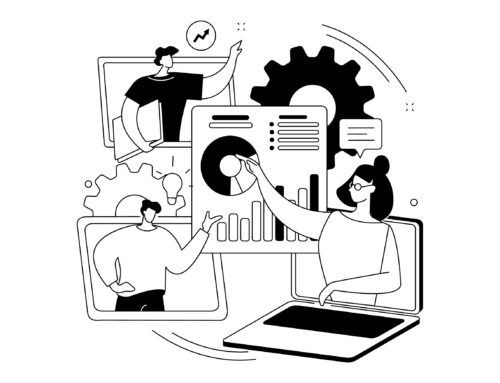
4. Can you give a few examples of UX Design principles you put into practice?
Overall, user testing has been tremendously helpful. Also, realizing that this is an iterative, ongoing process. We keep progressing according to the feedback we receive.
In terms of making the online store more user-friendly, we already did several things – but of course, there’s always room for improvement. One thing that is specific to Puratos is that our customers tend to buy the same products over and over again. So, since the very first version of the platform, we included the functionality to view customary products and previous orders, to facilitate our client’s task.
After the first tests, we also realized that different customers give different names to the same product. For example, some customers might look for “icing” while others may type “frosting”. The problem is that we need to keep the product information section short, thus we cannot add every synonym in the product description. The solution was to add “invisible” keywords in the product pages to make sure that everyone finds what they are looking for.
We also had to temporarily remove the search bar from the top of the e-shop homepage. Our site is divided into two areas: one public, which only displays core products, and one after logging in, which displays the full list of products. Each area has its own search engine.
The upper search bar only searches core products that are available in the public area and not the full catalogue. So if a logged-in user wanted to find a non-core product, s/he needed to use the second search engine, in a lower area of the page, to search from the full list. As the upper search was more visible, everyone simply ignored the lower one.
We decided to temporarily remove the upper search in an attempt to force customers to use the lower search. But now we are working to harmonize both search engines and keep only one search bar. It looks like the obvious choice now, but we couldn’t have thought of it if the customer feedback wasn’t there.
5. During my research on this topic, I came across a lot of content that compared the B2B and B2C e-commerce websites. As a B2B e-commerce manager and B2C consumer, what is your input on this?
I think the main difference between them is the time and mindset.
When I’m buying for myself, I do it on my own time, so it’s more of a leisurely activity. I might not know what I’m looking for exactly and that’s okay. That’s part of the experience.
When you are buying for work, on the other hand, you are doing it in your work time, so being efficient is the most important thing, I would say. Also, you need more detailed information about the products and their usages.
For example, when our customers are buying chocolate, they might want to know where the cocoa is coming from and how it is produced, as they may also have their own clients asking the same questions. When it comes to usage, we sell many types of chocolate: some are more suitable for patisserie, while others may be better for creating chocolate bars. We know that some customers will carefully check the composition of each product to make a choice and we need to provide them with this information – all while making sure we keep product descriptions short and easy to understand.
6. Thank you for your input. Any last tips you want to give to fellow B2B e-commerce professionals?
As a last note, I think it’s important to find the right balance between giving users too many and too few options. Having few choices may lead to frustration but having many choices may lead users to a choice paradox (they can no longer choose because there are too many possibilities). A good example applies to filters. If you give users too many categories to choose from, they might complain that their choice is too narrowed down and that they only have 3 products per category. On the other hand, if you only give them three categories to choose from, they will have too many results and may not be able to find what they’re looking for. Once again, the magic word is testing.